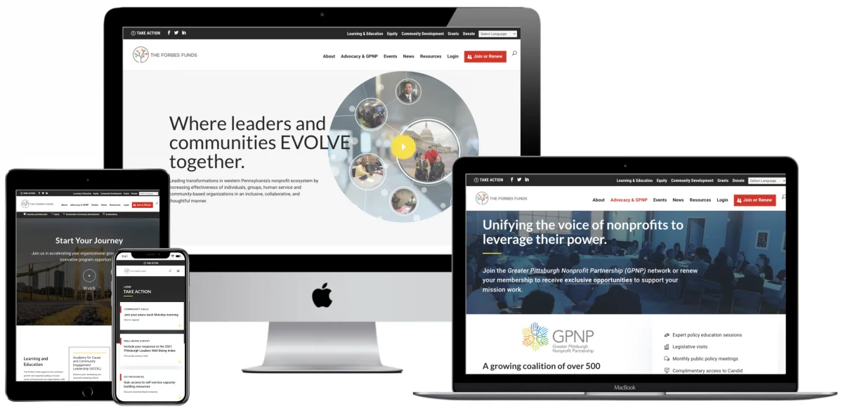
By the time you’ve finished reading this small paragraph, someone could already be clicking off your website. Users generally give a website 15 seconds before they judge the content and decide whether to stay or not. To read these three sentences, you may have taken about ten seconds, by the way, so it doesn’t take long to generate an impression, for better or worse.
What does that mean for you? Well, you want to ensure that you have a visually appealing website with amazing content that keeps your audience’s attention? How do you do that? Well, as a starting point, let’s take a look at the common website design mistakes.
You haven’t checked your bounce rate
A common marketing mistake is not finding out what your bounce rate. Bounce isn’t a good thing in the world of websites. It’s basically how long it takes someone to look at your website and decide, ‘I gotta bounce’. Maybe the etymology of the slang word has something to do with the trajectory of a bouncing ball, who knows? Either way, a high bounce rate means that people aren’t staying on your page and you need to find out why. Your goal is a low bounce rate.
You can check your bounce rate on your Google Analytics Dashboard. For some pages, a high bounce rate is normal. For example, you might expect users to navigate away from your homepage fairly quickly or move from a landing page to a thank you page quickly. Often users bounce for different reasons. Your page might either be unengaging or, on the other end of the spectrum, they found what they were looking for.
Generally, bounce rates between 25-30% are exceptionally low. Figures between 30-40% might also be considered fairly low but more realistic. Bounce rates over 50-60% need to be monitored and anything higher needs an overhaul.
For a particularly poorly designed page, you can fix your poor bounce rate by optimizing and redesigning the page. Easy does it!
Customers have no idea what you do
Above the fold is one of those trends that phasing out of web design, but so many web designs feature this stunning imagery with random words above the fold, leaving your potential customer with a sense of amusement or befuddlement but also with absolutely no idea what you do. If your user cannot tell what you do within that 15-second golden period, then your design is not effective.
‘Above the fold’, we should be able to see your logo, get a sense of your branding, have somewhere to go (navigation of some sort, CTAs), and, all importantly, know what the company does, sometimes even with a mission statement and a tagline.
Your website is not mobile-friendly and it takes ages to load
Your website should adapt from mobile to tablet to PC seamlessly and it should load on all of those devices in under three seconds (because 40% of people will give up if it takes longer). If a user is on mobile and has to rotate their phone, pinch to zoom, and move their phone in all directions, you’ve just created a terrible user and customer experience probably increased your bounce rate and sent your website back about a decade into the past. Get mobile-friendly and ensure all of the elements on your page load quickly.
Your text can’t be read and it’s not scannable
If you have a light grey background with white writing or a big colorful image with barely-visible text over it, that’s not good design. Likewise, even if your text can be read but you write in incredibly long paragraphs and don’t have headings, that’s not good design either. It’s an internet age of fast-paced information and if I’ve just Googled ‘How do I backup my WhatsApp messages’ or ‘Which dust mask rating do I need when sanding furniture’, I should be able to scan the relevant pages for quick instructions, without having to read every word. And every word should be seen with an appropriate amount of whitespace and headings for clarity.
As much as we’d love readers to hang onto our every word (we hope they do), it’s also entirely unrealistic to write blog posts as if they were chapters of a novel. You have to adapt your web content to your audience.
Your potential customers don’t know how to reach you
Your contacts page is one of the most important pages on your website. Potential customers and returning ones should know how to get in touch. How many websites have you been on where it’s almost impossible to find a phone number or an email address to talk to someone? Probably more than you’d care to remember!
Need a brand new web design and development?
Those were our quick tips for common website design mistakes, but there are plenty more you could make!
If you want a visually appealing website design and development with SEO in mind, connect with Key Medium today and unlock your success. We create branded online experiences that generate growth and success. Take a look at some of our success stories.
If you want to read more about ways to keep your audience’s attention, check out some of our past content.
- How to Test Prototypes for Usability Issues
- UX Design Trends in 2020
- Common Branding Mistakes that Hurt Your Company Image
- Customer Experience vs User Experience

Elaine Frieman holds a Master’s Degree and is a UK-based professional editor, educational writer, and former marketing agency content writer where she wrote articles for disparate clients using SEO best practice. She enjoys reading, writing, walking in the countryside, traveling, spending time with other people’s cats, and going for afternoon tea.

