
More and more users are spending time on mobile sites, so getting a mobile site right for your business is crucial to your success. In a mobile-led world, consumer expectations are high.
Users will drop off if your website is too slow to load.
On the other hand, a fast-loading site with a bad user experience design makes it hard for users to navigate your site and complete their desired action.
Consider this:
A staggering 62% of customers will consider switching to a competitor after only 1-2 bad experiences. More than 90% of customers share details about bad experiences with others. And 25% would pay more for a better customer experience, regardless of product type. 5
What do we mean by mobile sites?
Simply put, mobile websites are websites accessed through a mobile phone or tablet’s web browser (Safari, Chrome, Firefox, and so on). Modern web design principles utilize mobile-first methodology, which eliminates unneccassry code. This has performance and website speed benefits for both mobile devices and desktop. It also contributes to a high-quality and positive user experience.
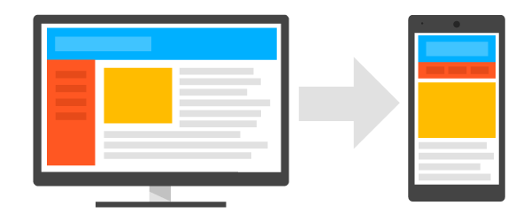
Responsive design frameworks and principles are very similar and work by shifting content to specific sizes (viewport widths and height for various breakpoints like with smartphones, tablets, laptops, and wider desktop screens), depending on the website design. See the figure below, which depicts a desktop website transforming into a mobile site.
Mobile websites do not require any installation or updates.
Unlike mobile applications, mobile websites can be ubiquitously accessed and without the need to be downloaded.
Websites function almost identically to mobile apps with progressive web application (PWA) principles, and there is an “add shortcut to home” option. Twitter has successfully used PWAs to improve engagement with their mobile site. They call it Twitter Lite.
Nicolas Gallagher, the Engineering Lead of Twitter Lite, explains:
Twitter Lite is now the fastest, least expensive, and most reliable way to use Twitter. The web app rivals the performance of our native apps but requires less than 3% of the device storage space compared to Twitter for Android…
Why do users engage with mobile sites?
- Mobile sites are simple & easy to discover. People are constantly connected to their phones.
- Mobile sites are lightweight & fast. Device memory is not needed for installation.
- Mobile sites are intuitive. Users can easily navigate them.
Read more about mobile website speed statistics, or test your mobile website speed.
What are the benefits of Mobile Sites for businesses?
As Google recently deployed mobile-first indexing in 2018, this makes mobile website speed extremely important for not just a user’s mobile experience, but for ranking in search.
Consider this about mobile websites:
51% of smartphone users have purchased from a company/brand other than the one they intended to because the information provided was useful. 3
Did you know? Google actively experiments with their algorithm, and there are plans to rank websites based on the page’s mobile version.
But wait, that’s not all Google is planning.
Page Speed as a Ranking Factor for Mobile Searches
Starting in July 2018, page speed will be a ranking factor for mobile searches. 4
This is big for ranking in search. As Google transitions to index websites based on their mobile variation – a fast website is more important than ever.
Mobile site speed testing helps improve mobile site speed and overall website performance and experience.CHECK YOUR MOBILE SITE SPEED:
Not only is Google’s Mobile Website Speed Test fast, it’s also free at RunningSEO.
6 Big Benefits of a Mobile Site
- Build once, run everywhere. Mobile site work on iOS, Android, and all other platforms with a browser & internet connection.
- They are adaptable. Here at Key Medium, we build mobile-first sites to address both phones and tablets rather than building two distinct apps for each device.
- Shorter development timelines! Mobile sites enable us to allow for easy updating. Unlike apps, users don’t need to accept or install any updates.
- Lower development costs! Money talks and mobile sites are typically less expensive to build because they use a single coding language (HTML).
- The web is open for all! Mobile sites require no approvals, revenue sharing, or marketplaces.
- Tracking is simpler. Google Analytics and Conversion Tracking can extend to your mobile site, instead of installing a software development kit.
Build Better Mobile Experiences
Faster mobile experiences can lead to more engaged customers and higher revenue. Uncover new insights, data and perspectives from industry leaders shaping mobile’s future. #SpeedUp here.
What about Accelerated Mobile Pages (AMP)?
AMP is very strict in how pages are structured.
BMW.com uses AMP for both its desktop and mobile website, which makes it easy for them to achieve the best performance (and user experience) online.
- Accelerated mobile pages don’t let extension mechanisms block page rendering. AMP pages support extensions like lightboxes, Instagram embeds, tweets, and more.
- To keep JavaScript from delaying page rendering, AMP allows only asynchronous JavaScript, and all third-party JavaScript is kept out of the critical path.
- Limitations on stylesheets (CSS): Using the Bootstrap framework may only be an option if the stylesheet is reduced to under 50KB. It is highly recommended to use Basscss, an atomic CSS library with a bunch of utility and responsive classes, which is already included with AMP pages. Read more: Better Engage Users with Accelerated Mobile Pages
What makes an excellent mobile website?
Goal-oriented mobile users expect to be able to get what they want – and on their terms – quickly and easily. The following is an overview of an extensive, in-person usability study conducted by Google in the United States. The study uncovered 25 mobile site design principles, grouped into several categories.
—Homepage and Site Navigation
- Keep calls to action front and center.
- Keep menus short and sweet
- Make it easy to get back to the homepage
- Don’t let promotions steal the show
- Make site search visible
- Ensure site search results are relevant
- Implement filters to narrow results
- Guide users to better site search results
—Commerce and Conversion
- Let users explore before they commit
- Let users purchase as guests
- Use existing information to maximize convenience
- Use click-to-call buttons for complex tasks
- Make it easy to finish on another device
—Form Entry
- Streamline information entry
- Choose the simplest input
- Provide visual calendar for date selection
- Minimize form errors with labeling and real-time validation
- Design efficient forms
—Usability and Form Factor
- Optimize your entire site for mobile
- Don’t make users pinch-to-zoom
- Make product images expandable
- Tell users which orientation works best
- Keep your user in a single browser window
- Avoid “full site” labeling
- Be clear why you need a user’s location
Hire an Affordable, Experienced Google Mobile Sites Expert
You have a lot to think about if you’re considering a mobile app, website refresh, or new website design. If you’re interested in having the experts at Key Medium craft a website proposal for your new custom website, connect with us, and let’s talk. We have many tips and articles on selecting your next web design partner here, and you can also learn about what a web design Statement of Work is here.
About Key Medium Insights
Our mission is to equip nonprofit organizations, startups, and small businesses with the tools they need to grow their networks online. The Key Medium Insights Blog supports that commitment by providing helpful information that empowers professionals like you to research, learn, and implement initiatives that will support your unique goals.
How Fast is Your Site? Take the Mobile Site Speed Test.
Sources & References:
